Website redesign
Reflecta website
Website redesign for a self-insight app
A redesign of reflecta.life around an animated story, with six assessment pages linked by one thread transition. No framework.
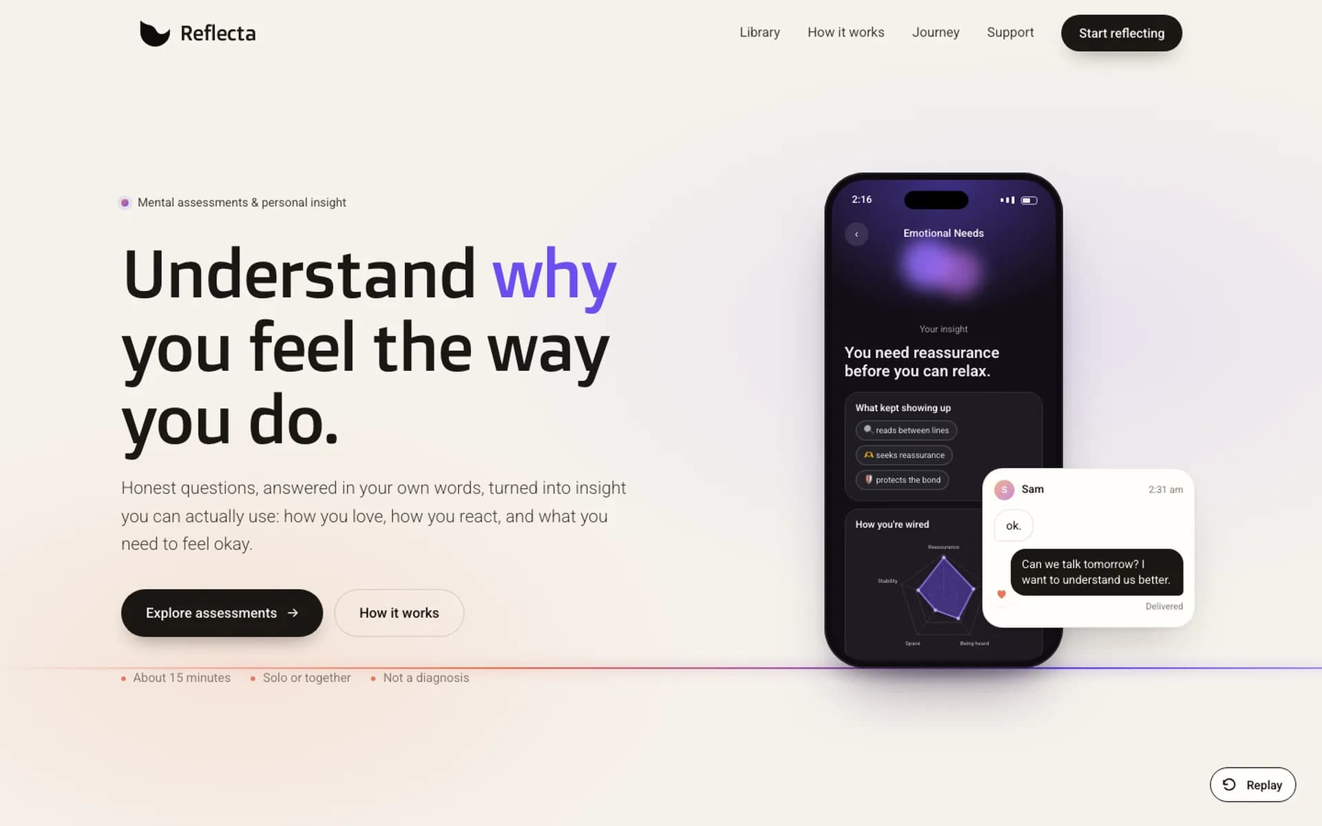
Sketch to Ship
Headline on the left, the insight it leads to on the right.
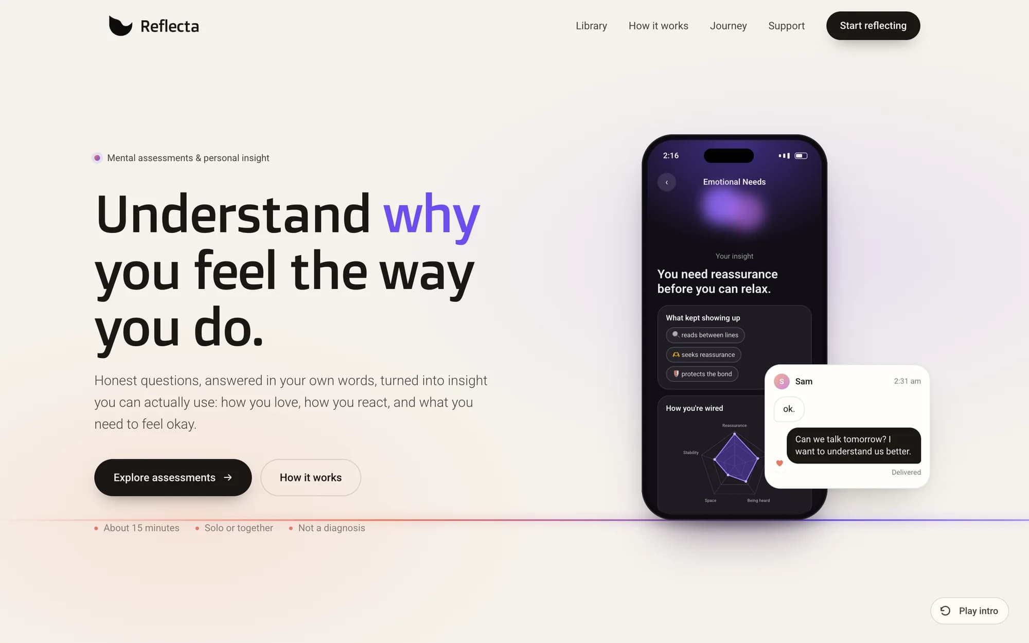 Shipped
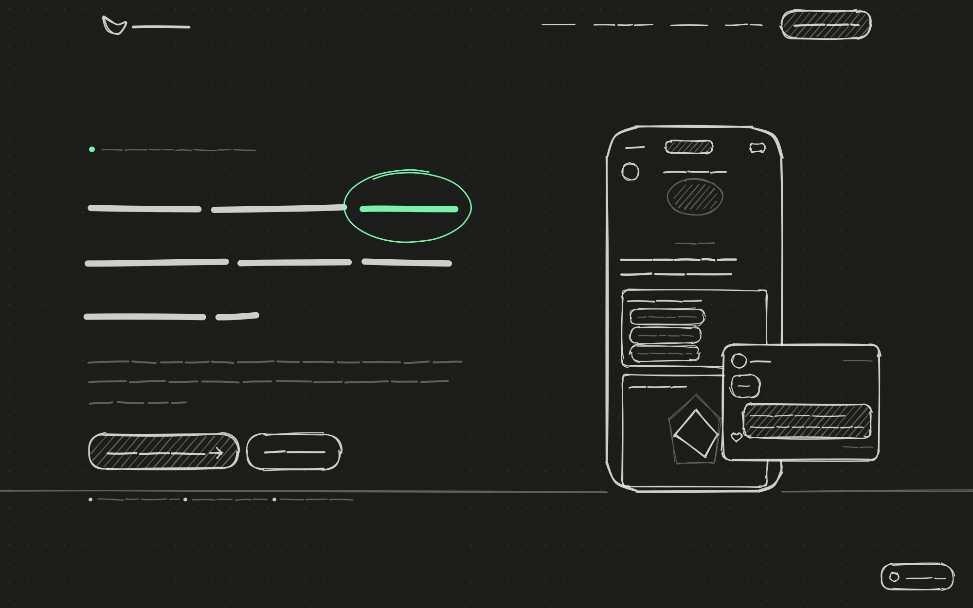 Sketch
Stack
- HTML
- CSS
- JavaScript
- SVG animation
- Motion design
- Type
- Website design
- Client
- Reflecta
The problem
Reflecta is an app of short mental assessments. The landing page had to explain, in a few seconds, the feeling the app is for, then lead people to the assessment that matches their question.
What it does
The redesigned site opens with a short film: a late-night "ok." text tangles into a line that Reflecta pulls straight, then draws the app's real screens. The library starts from the questions people ask themselves, and each one opens its own assessment page.
How it's built
Plain HTML, CSS, and JavaScript, with no framework and no build step, served as static assets on Cloudflare. The thread is an SVG path computed from the viewport, so the hand-off between the landing page and an assessment page lines up. Typography uses Roboto and Doppio One.
Key features
Motion
- An intro film that starts from a 2am "ok." message and ends on the app's real screens, with a Skip intro button and a Watch the intro again link
- Library cards leave through a full-screen tangled thread; the assessment page opens on the same tangle and pulls it straight before its own scene starts
- Each assessment page has its own looping scene; Emotional Needs fills its heart with a simulated pour
- Scroll reveals driven by IntersectionObserver and requestAnimationFrame, with prefers-reduced-motion respected
Pages
- Landing page: library, how it works, journey, trust ("Not a diagnosis. A mirror."), support, and legal sections
- Six assessment pages: Attachment Style, Emotional Needs, Overthinking Patterns, Shadow Traits, Burnout Risk, Love Languages
SEO and assets
- A question-led title for each assessment page, with its own share image
- Canonical URLs, Open Graph and Twitter cards, and JSON-LD (WebSite, Organization, MobileApplication)
- Sitemap, robots.txt, web manifest, favicon set, and a new logo
Scope
Redesigned and built the website
- Landing page redesign with the intro film and the thread story
- Six new assessment pages, each with its own scene and share image
- Typography (Roboto, Doppio One), logo, favicon set, and share images
- SEO: canonical, Open Graph and Twitter cards, JSON-LD, sitemap, robots, web manifest
Screens
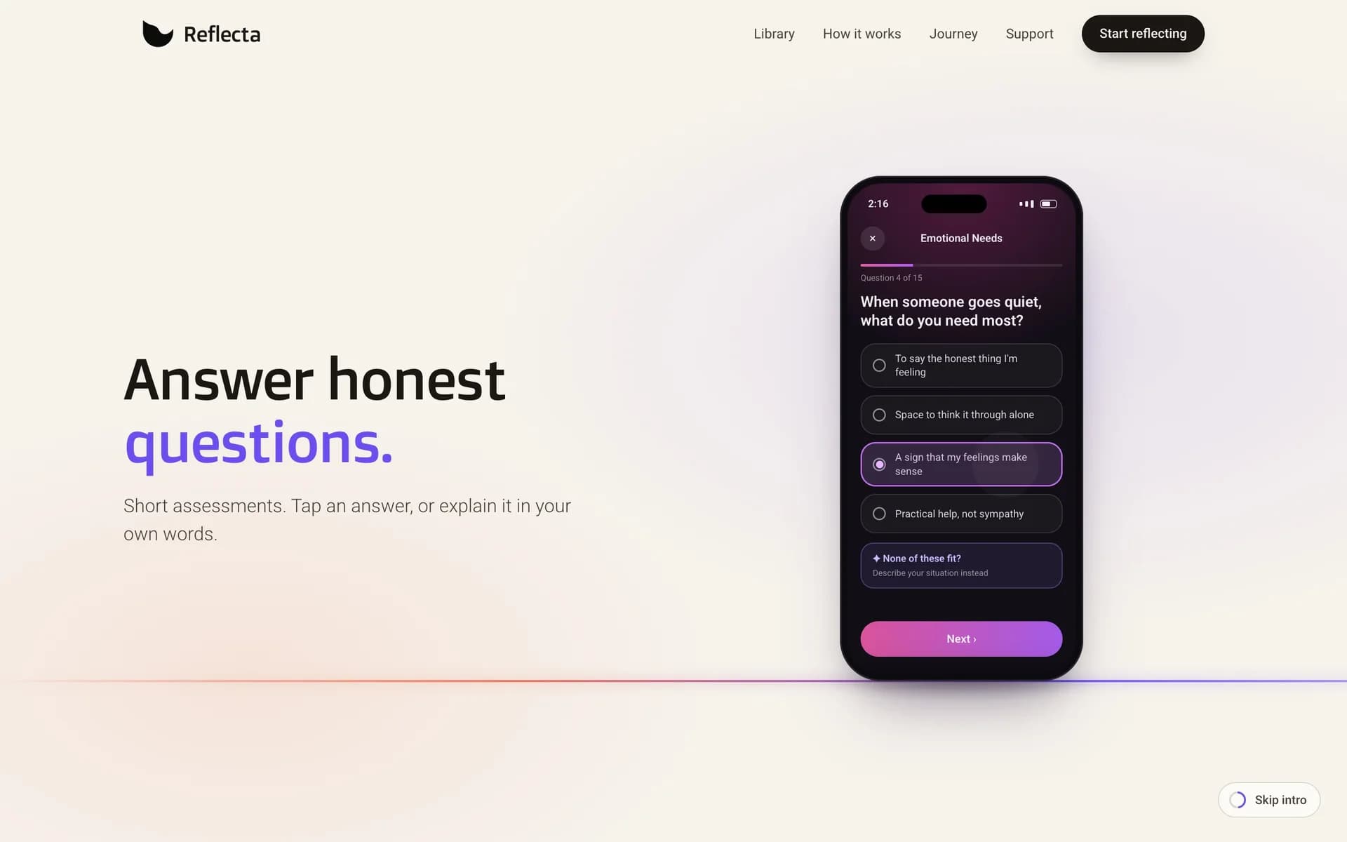
Homepage hero animation 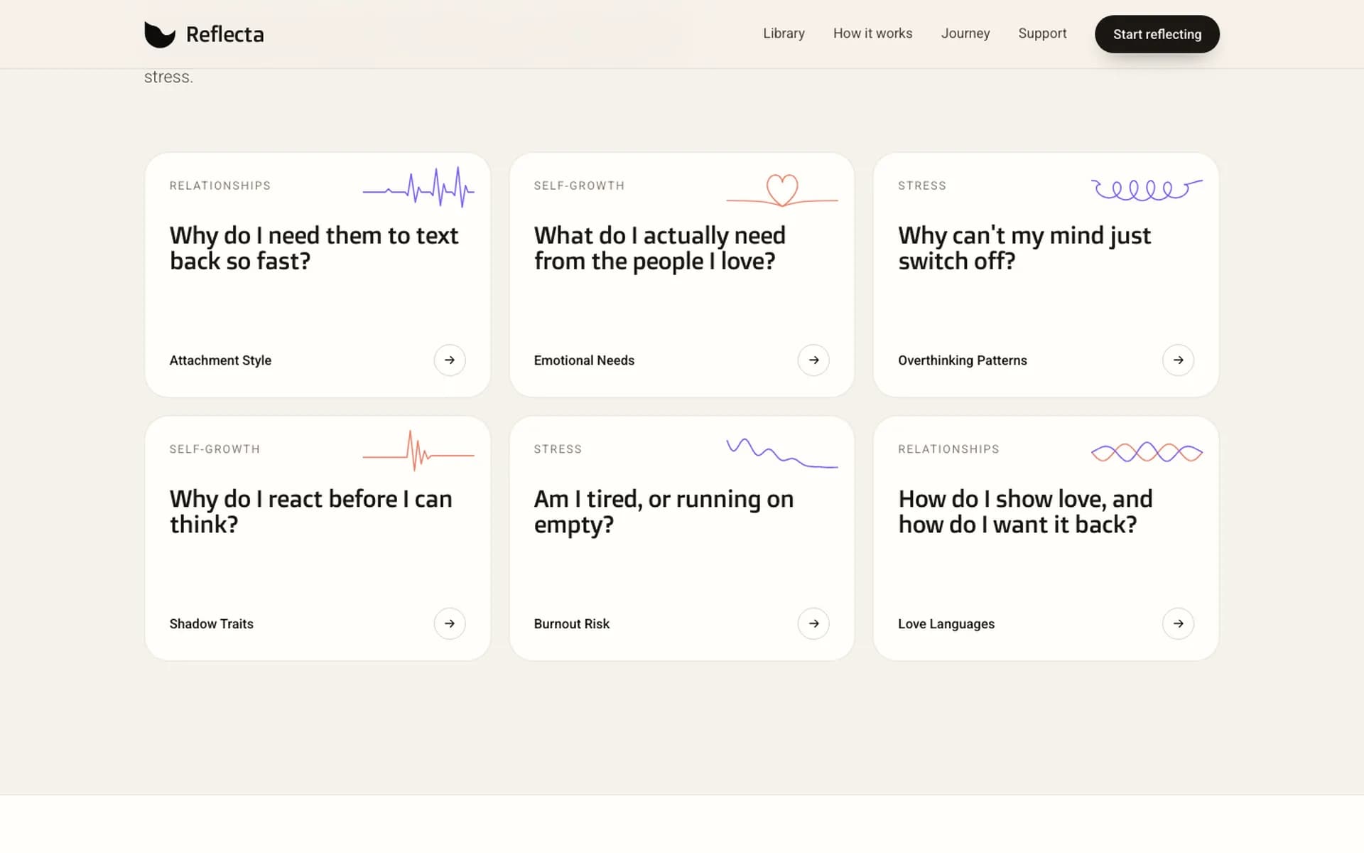
Use case: Burnout Risk 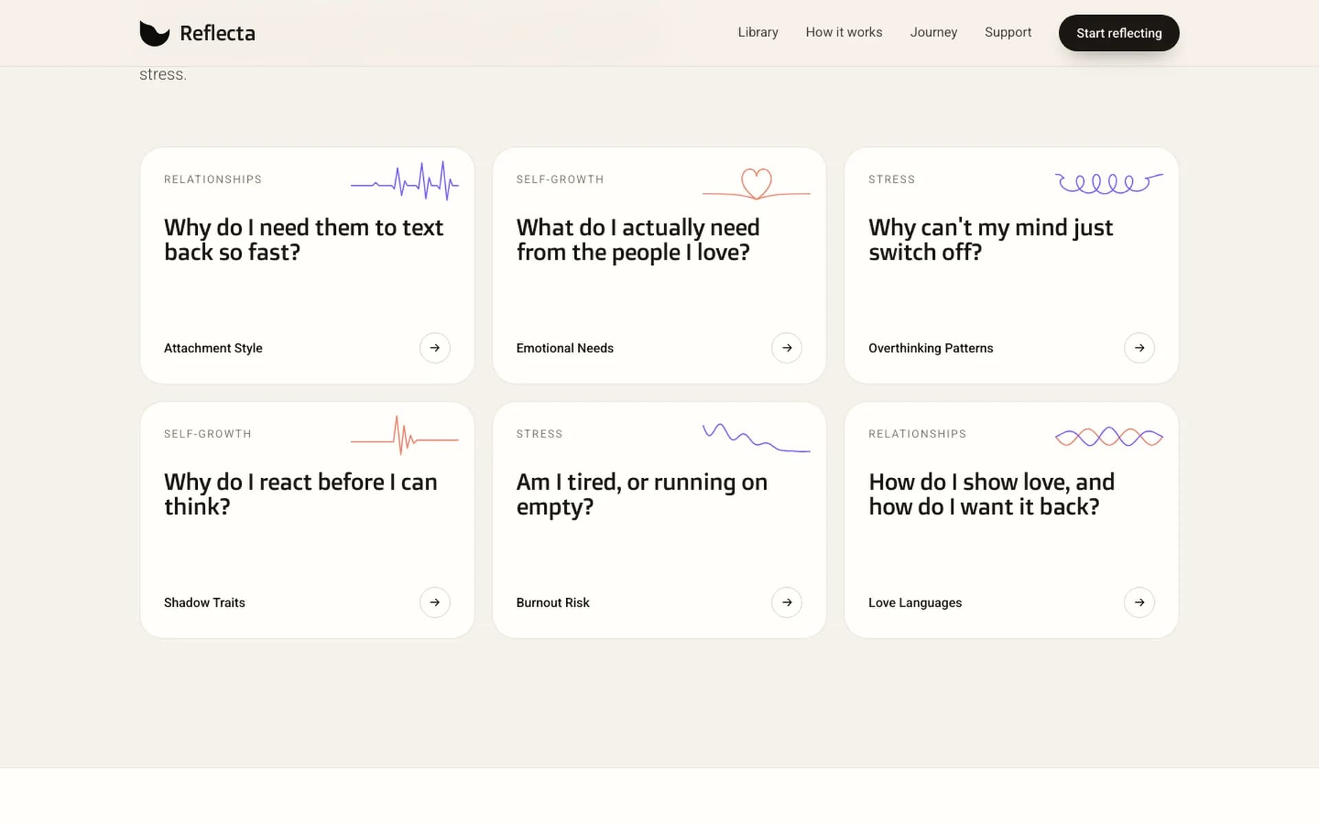
Use case: Attachment Style Homepage hero 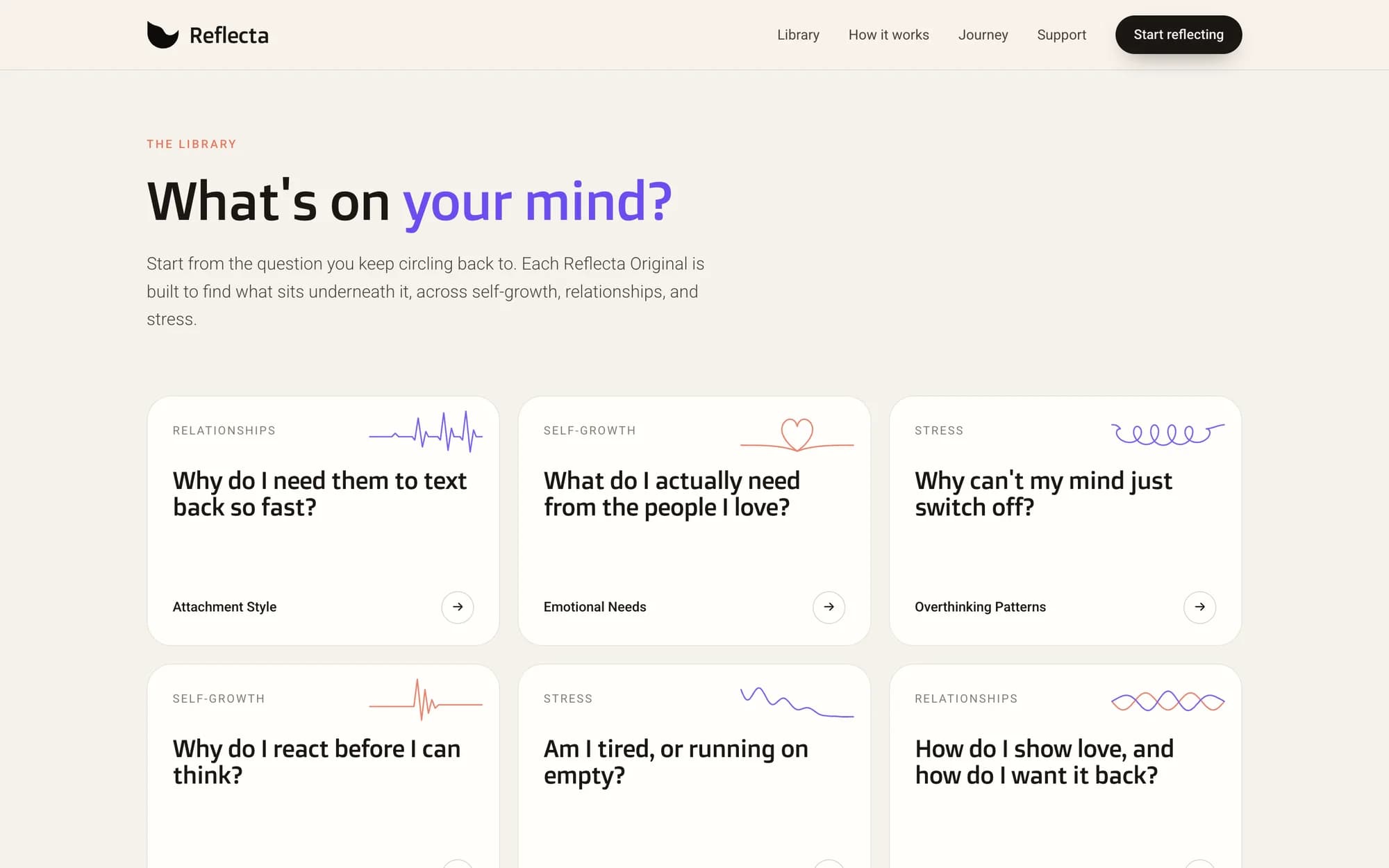
Question library 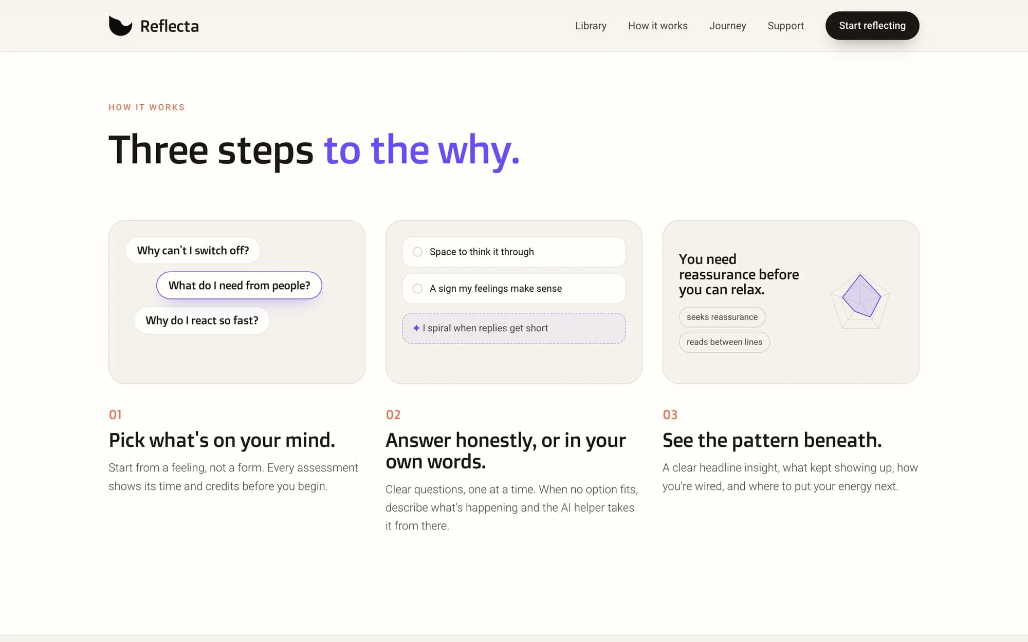
How it works 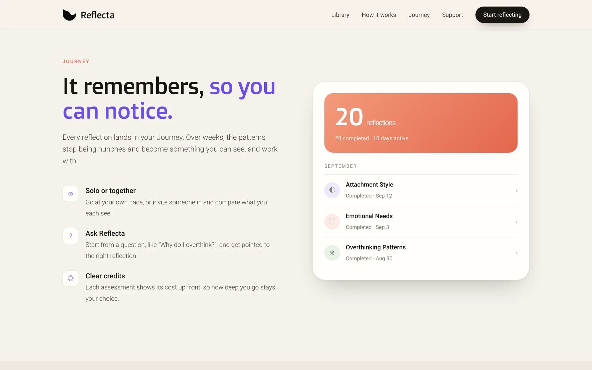
Journey 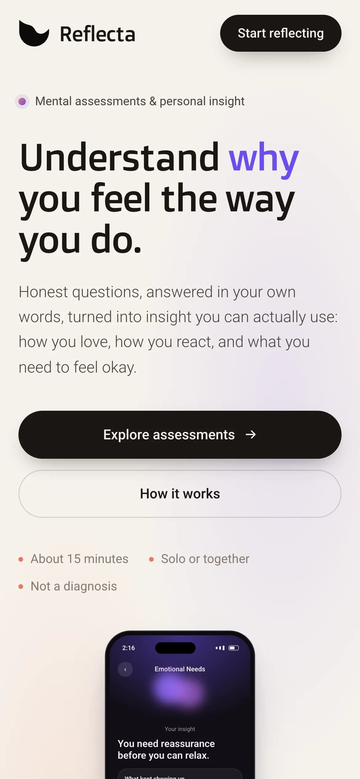
Mobile homepage
Contact
Want something like this built?